Format Pivot Table with Colours
Do you know that you can format a pivot table with colours to facilitate viewing or presentation? I have always thought that the pivot table is only a good analytical tool but not a good report presentation tool. This is because the results displayed are very plain with the fields colored grey and the data are all nested within lines that outline the pivot table with a white background. I was totally wrong. I found that you can actually format the pivot table to make it look professional and use it for reporting.
The question is how? I took a fair bit of time to figure out how to format the pivot table so that the colors appear at the right place. And you don’t need to purchase tools that will help you to format the pivot tables. Here is the step-by-step guide to achieving a colorful professional-looking report.
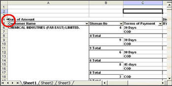
1. Format the entire pivot table with the right colour and font
a. Select the entire pivot table
i. Move your cursor to the top left corner of the pivot table.
ii. Click on the left mouse button.
b. Format the pivot table based on your preference
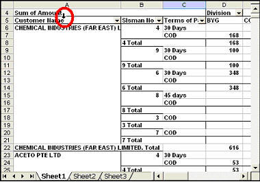
2. Format the Rows
a. Select all the values in a row area.
i. Move your cursor slight above the row name.
ii. Click on the left mouse button.
b. Format the row with your own reference
c. Repeat for the next set row values.
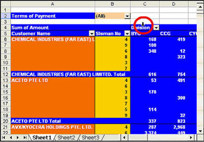
3. Format the Column Headers
a. Select the column headers
i. Mouse your cursor slightly above the column name
ii. Click on the left mouse button
b. Format the column header with your preference
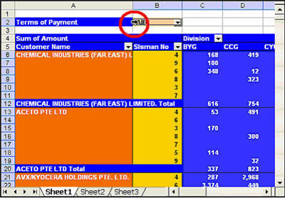
4. Format the Data Area.
a. Select the data area.
i. Place your cursor to the left of the value on any of items in the page area.
ii. Click on the left mouse button
b. Format the Data area.
5. Format the SubTotal for the rows.
a. Select the subtotals
i. Move your cursor to the left of any one of the subtotal
ii. Click on the left mouse button.
b. Format the subtotals.
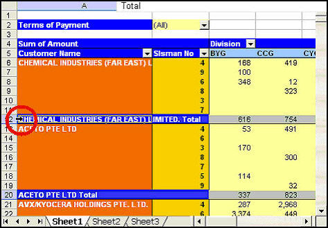
With the above guide, you no longer need to pay for any solution or add-ins to format pivot table
